
Matching gray carpet to gray walls isn't automatically the safest choice. A near match can make the walls look blue, the carpet look brown, and the whole room feel less coordinated than it did before.
If you're deciding what color carpet to go with grey walls, start with undertone and actual room lighting, not the color name on the sample. Warm greige, taupe and soft beige are useful starting points, but the right choice also has to work with your trim, adjoining floors and daily cleaning needs.
Carpet Shades That Pair With Each Gray Wall
Match undertones for a calm room, or introduce a deliberate warmer or cooler carpet for separation. Don't try to duplicate the wall color without checking how the materials look together.
Use this comparison as a shortlist, not a purchase decision. The shades to avoid are caution flags for these combinations, not colors that can never work.
Carpet shades to pair with each gray wall undertone
| Wall undertone | Carpet shade that works | Visual effect | Shade to avoid |
|---|---|---|---|
| Cool blue-gray walls | Warm greige, sand or soft beige | Warmth softens the coolness and keeps the room calm | Icy blue-gray carpet that looks flat |
| Green-gray walls | Warm taupe or mushroom | Earthy tone sits comfortably with the green undertone | Pinkish or stark white carpet |
| Violet or mauve-gray walls | Neutral greige or soft taupe | Keeps the violet from turning muddy | Bright yellow-beige carpet |
| Warm beige-gray walls | Taupe, camel or warm greige | Matching warmth creates a low-contrast, cohesive room | Cool blue-gray carpet that makes walls look brown |
| Dark charcoal or deep gray walls | Light greige or cream | Lifts brightness and prevents a closed-in feel | Charcoal carpet that makes the room heavy |
| Light silver-gray walls | Medium greige or taupe | Adds grounding so the floor doesn't disappear | Very pale cream that blends into the wall |
Identify the wall's underlying color
Hold a plain white sheet of paper beside the painted wall. Against that reference, decide whether the gray leans blue, green, violet or beige. Use an area away from a brightly colored curtain or sofa, which can distract from the comparison.
Judge the paint in the room where the carpet will go. North-facing daylight can make a gray appear cooler, while yellow-toned bulbs can make it look warmer. If you still can't identify the undertone, greige and warm taupe are sensible starting points, because they sit between the warmer and cooler neutral families.
For a closer look at combining these neutrals, the Guynn Furniture & Mattress color pairing tips offer useful context for beige-and-gray schemes. Apply that relationship to your furnishings as well as the floor.
Choose a few candidates from the relevant row. A modern room might benefit from a clearer tonal contrast, while farmhouse and classic rooms often suit softer transitions between carpet, wood and upholstery. Shortlist two or three shades, then test them at home before buying.
Why Undertone Matters More Than Matching Gray
Say a living room has cool blue-gray walls and a gray carpet that looks almost identical in the showroom. Once the carpet covers the floor, its faint beige cast becomes obvious, while the wall looks bluer. Neither surface is necessarily wrong, but the near match makes the difference difficult to ignore.
The same room with warm greige carpet can feel more settled. There's enough distinction to make the pairing look intentional rather than like an unsuccessful attempt to match.
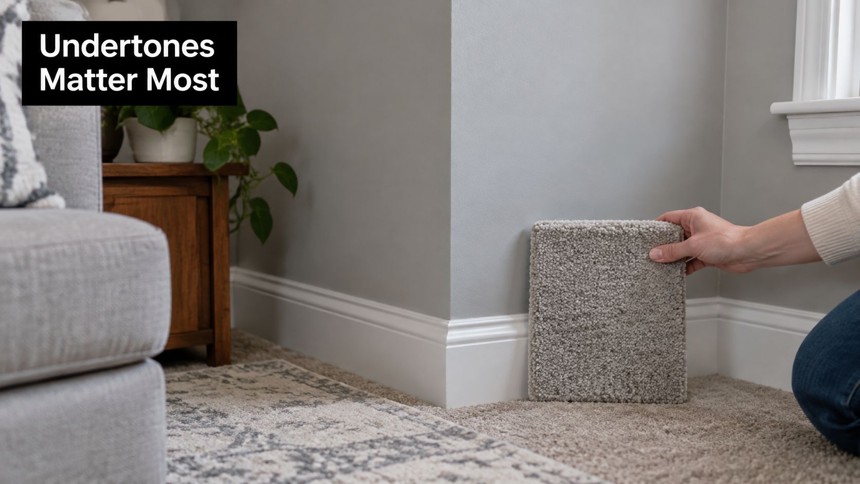
Choose a relationship, not a duplicate
Gray paint can carry blue, green, violet or beige undertones. The coordinating approach described by Homes & Gardens supports choosing compatible undertones and checking the relationship between the floor and walls rather than treating gray as a single neutral.
Neighboring surfaces change how we perceive each other. Warm beige carpet can make a blue-gray wall appear cooler; blue-gray carpet can make a warm gray wall look more yellow or brown.
That leaves two reliable approaches:
- Shared undertone: Choose related gray, slate or muted blue tones for a controlled, low-contrast scheme.
- Deliberate contrast: Use a restrained warm neutral against cool gray when you want more depth and separation.
Avoid a near match that differs only slightly in shade and introduces an incompatible undertone. Gray-on-gray can work, but texture and a clear difference in depth usually make the intention easier to read.
Practical rule: Coordinate the underlying color before deciding how light or dark the carpet should be.
Include the fixed finishes
White trim, oak flooring, cabinetry and upholstery belong in the decision. A mushroom carpet might work beautifully against the wall yet look pink beside an adjoining oak floor.
Use our guide to choosing flooring color to organize those fixed elements before narrowing the carpet selection. This matters just as much in a Cumming bedroom as in an open-plan Johns Creek or Milton living room: undertone first, shade second.
Matching Carpet Lightness to Your Room's Light
A pale carpet and a charcoal carpet solve different problems. In a small room with gray walls and limited daylight, light greige can provide a brighter foundation; in a spacious room with generous windows, charcoal can create an intentionally enclosed, dramatic setting.
Light Reflectance Value, or LRV, describes the percentage of visible light a surface reflects on a 0–100 scale, as explained by the Carpet Institute of Australia's light-reflectance guide. Higher-reflectance flooring returns more light into the room, but brightness shouldn't be your only criterion.
Balance brightness with upkeep
Pale cream can help a dim room feel less heavy, but it also makes soil and staining more noticeable. Don't choose it for a busy route from the garden unless you're comfortable with the cleaning commitment.
Charcoal absorbs more light and can make medium or dark gray walls feel more enclosing. Reserve that combination for a well-lit room where you want a moody effect, rather than using dark carpet to conceal dirt.
| Priority | Useful starting point | Main compromise |
|---|---|---|
| Brighten a dim room | Pale greige or warm cream | More visible soil |
| Balance light and everyday use | Medium-light greige or taupe | Less dramatic contrast |
| Create a dark, enclosed scheme | Charcoal | Reduced perceived brightness |
| Disguise small debris and tracking | Heathered or subtly patterned neutral | More visible texture |
Heathered carpet introduces tonal variation without requiring a bold pattern. Keep enough distinction between the floor and wall so the room doesn't read as one uninterrupted gray surface.
Before choosing, note whether the room receives direct sun, whether its LEDs look warm or cool, and whether it stays dim for most of the day. Choose for the light you live with, not the brightest moment during a showroom visit.
How to Test Carpet Samples Beside Your Walls
A carpet that matches the wall chip too closely often fails at home: same hue, different scale, and the room turns flat because pile absorbs light while painted drywall reflects it. Lighting, surface texture and viewing direction all shift perceived color, as Dunn-Edwards' technical guidance on lighting and texture explains, so judge undertone under your lamps before judging the name on the label.
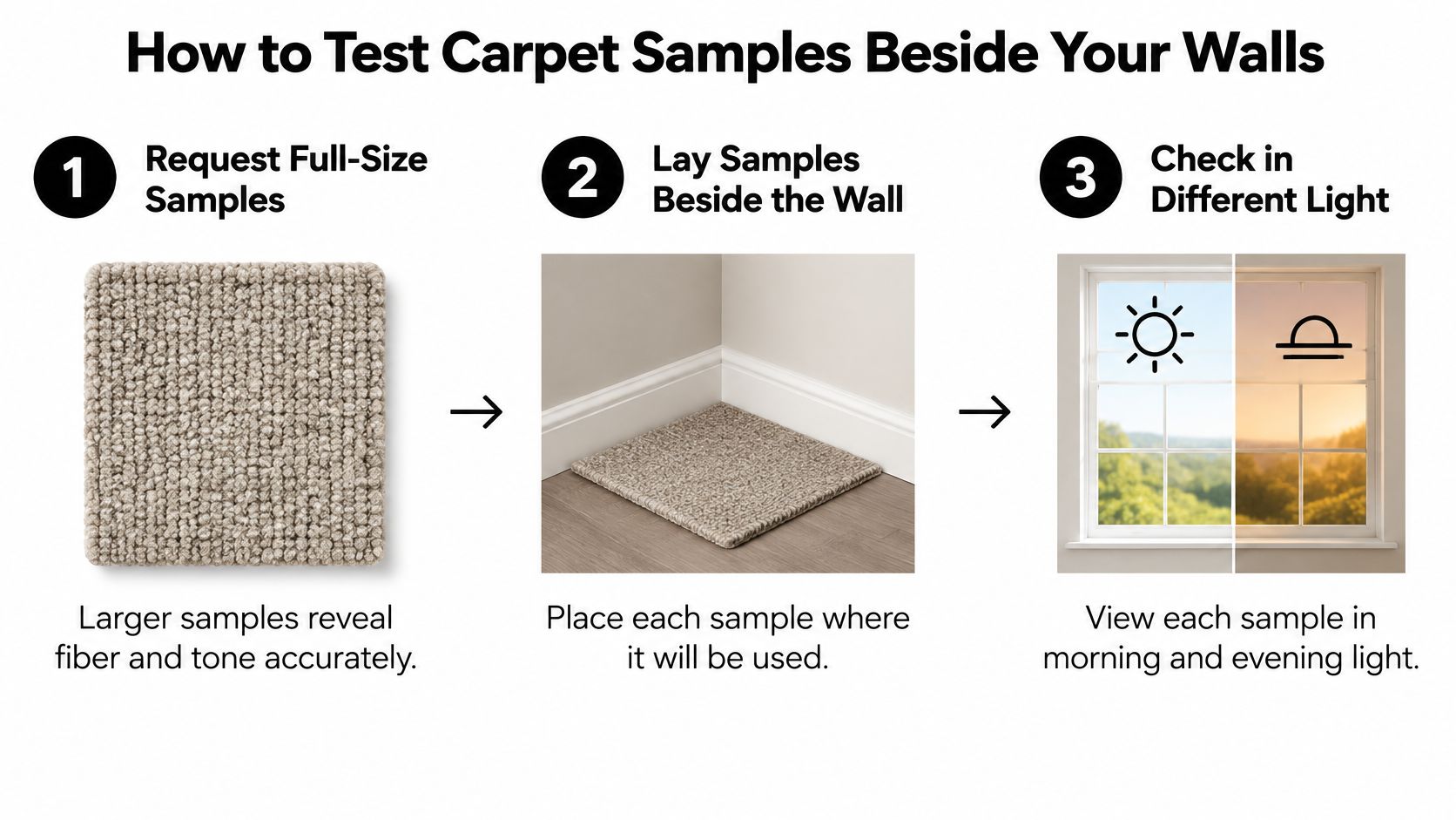
Follow the same routine for every finalist
Request full-size samples. Larger pieces reveal fiber variation and texture that tiny swatches conceal. If a swatch is too small to read pile direction, arrange bigger pieces through the flooring samples page and compare like with like.
Lay each sample where it will be installed. Place it flat beside the wall and secure a corner near the baseboard with finish-safe, low-tack tape if needed. A wall stays vertical and carpet stays horizontal, so a shade held upright can look cleaner than the same shade underfoot.
Check morning, afternoon and evening conditions. Use daylight first, then the lamps you normally switch on after dark. The common mistake is approving a sample during a sunny afternoon without seeing what happens under the room's installed bulbs.
Look from standing and seated positions. Walk around the sample and view it from the doorway, then from your usual chair. Carpet pile can appear lighter or darker depending on direction, so reject a shade only after it fails from the angles you use most often.
Bring the other materials into the comparison. Set the sample beside trim, door frames, sofa fabric, oak flooring and stone surfaces. For help considering the whole palette, Painters North Shore's advice on colour schemes that complement existing materials provides a useful framework.
Compare your top three finalists side by side. Remove any sample that develops an unwanted cold, pink or muddy cast in the room. Then view the strongest candidate alone, because a neighboring sample can exaggerate differences that disappear after installation.
Wait 48 hours before the final check. Treat this as a cooling-off period, and return to the finalist in the evening before ordering. Enthusiasm during the first comparison often over-rates a bold contrast and under-rates the quieter shade that wears better.
A good pairing feels related without requiring the carpet and wall to look identical.
Expect some change as the light shifts. The goal is a carpet that stays inside an acceptable color family all day and still feels calm after the lamps come on.
Carpet Picks for Bedrooms and Living Rooms
Carpet shade and texture by room type
| Room | Carpet shade | Texture | Why it works |
|---|---|---|---|
| Bedroom with gray walls | Warm greige or soft beige | Plush or soft loop | Warmth and softness suit a restful room |
| High-traffic living room | Medium taupe or heathered greige | Low-pile loop or textured cut | Hides tracking and everyday wear |
| Sunny living room | Light greige or cream | Dense cut pile | Maintains a light, warm-looking foundation |
| Dim room or lower-level space | Light warm beige | Smooth cut pile | Lifts brightness without looking stark |
| Home office with cool gray walls | Mid taupe or warm greige | Short, dense cut | Softens coolness and creates a quieter visual backdrop |
| Family room with pets or children | Mid-tone heathered blue-gray or greige | Tight loop, subject to snag assessment | Conceals stains and debris |
Bedrooms allow more emphasis on underfoot softness. Living rooms need a closer look at traffic routes, furniture placement and whether you'll tolerate visible footprints.
A sunny room doesn't automatically need the palest carpet available. If cream looks washed out beside the trim, move toward light greige instead.
Put household use ahead of appearance
For pet-friendly flooring, color is only part of the specification. Check whether claws could catch a loop construction, how spills should be treated, and whether the product's maintenance requirements fit your household.
The EPA's school indoor-air-quality checklist recommends carpet, cushion and adhesive tested and labeled through the Carpet and Rug Institute's IAQ programs, easy-to-clean materials, and constructions that don't allow liquids to penetrate the backing. Although written for schools, these are useful selection questions for a residential carpet installation.
- For pets and children: Prioritize cleanability and moisture management over an immaculate pale shade.
- For heavy traffic: Compare texture retention and maintenance instructions, not just stain-concealing color.
- For adjoining rooms: Check the sample at the hallway or dining-room threshold before approving it.
When carpet meets hardwood, tile or luxury vinyl plank (LVP) flooring, the transition becomes part of the palette. Tiles Mate Pty Ltd's discussion of flooring choices for open plan homes is useful for considering continuity between connected spaces.
If you're weighing the best flooring for pets or the best flooring for high traffic areas, don't assume carpet must win every room. Use our guide to choosing a good carpet for your home to assess whether it suits the intended use. Choose the room's demands first, then the shade.
When Warm Earth Tones Beat Gray-on-Gray
Gray walls don't require gray carpet. Soft camel, mushroom, muted olive, warm taupe and clay-toned neutrals can make a restrained room feel more comfortable, particularly alongside wood furniture and natural textures.
In reporting on 2025 design trends, Builder noted that 60% of surveyed design experts identified bringing nature into the home as a leading trend, while 49% cited warm neutrals. That supports considering warmer palettes, but it isn't a reason to discard a cool scheme you enjoy.
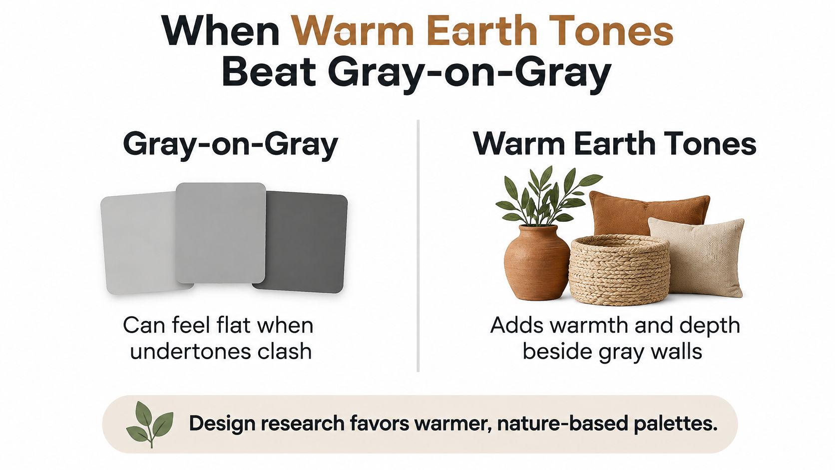
Weigh warmth against compatibility
- Pros: Camel and warm taupe soften a cool-looking interior and connect naturally with timber furniture.
- More individual options: Muted olive or a restrained clay neutral adds personality without requiring a bright floor.
- Cons: Some earthy shades look muddy beside green-gray paint or disconnected from very cool white trim.
For rental properties or resale preparation, I would start with medium earthy neutrals rather than highly saturated colors. They offer a practical middle ground between very pale carpet and a strongly personalized scheme. Renters should obtain permission before making permanent flooring changes.
Choose warmth because it improves the room, not because gray has supposedly become wrong.
Before committing, check durability, cleanability, expected replacement cycle and material sourcing. An earthy color doesn't establish that a product is sustainable, and a stain-concealing shade doesn't remove the need for maintenance.
Confirm Your Carpet Shade Before You Buy
Narrow the decision to a few tested shades before discussing the order. A showroom visit lets you see, feel and walk on flooring, while an in-home consultation puts the choice beside the finishes that will remain.
Our showroom has over 25 room-sized samples customers can walk on and visualize. Rug Specialist Sammy Espinoza can answer questions related to carpet; during the in-home process, a specialist asks about the project and helps select suitable flooring.
Bring a useful project checklist
- Wall information: Paint name and color code, plus morning, afternoon and evening room photographs.
- Room requirements: Measurements, main use, traffic routes, pets and children.
- Existing finishes: Trim details and samples or photographs of adjoining hardwood, laminate flooring, tile flooring or stone.
- Project scope: Whether you need carpet installation, flooring repair or complete floor replacement.
- Budget and timing: A complete installed quote, preparation requirements and a realistic installation schedule.
Whether you search for flooring Cumming, flooring Johns Creek, or flooring near me, evaluate scope before comparing headline prices. The same applies to flooring searches in Woodstock, Acworth, Alpharetta, Canton, Roswell and Marietta across Cobb County, Cherokee County, North Fulton, Forsyth County and Metro Atlanta.
For a wider renovation, compare hardwood flooring installation and the cost to install hardwood or LVP separately from the carpet quote. Ask what affordable flooring options include, whether factory-direct pricing claims are meaningful, and whether financing options are available rather than assuming they are.
For waterproof flooring for basements or scratch-resistant flooring for dogs, evaluate the specific product and room conditions. Don't let a promise of fast installation override preparation or moisture checks.
Order only the shade that still looks right in your room in the evening, after your 48-hour check.
Flacks Flooring offers carpet, hardwood and waterproof flooring, with showroom guidance and in-home consultations to help you coordinate the floor with gray walls and adjoining finishes. Visit Flacks Flooring with your paint details and room photographs to compare suitable shades and discuss the installation scope before ordering.